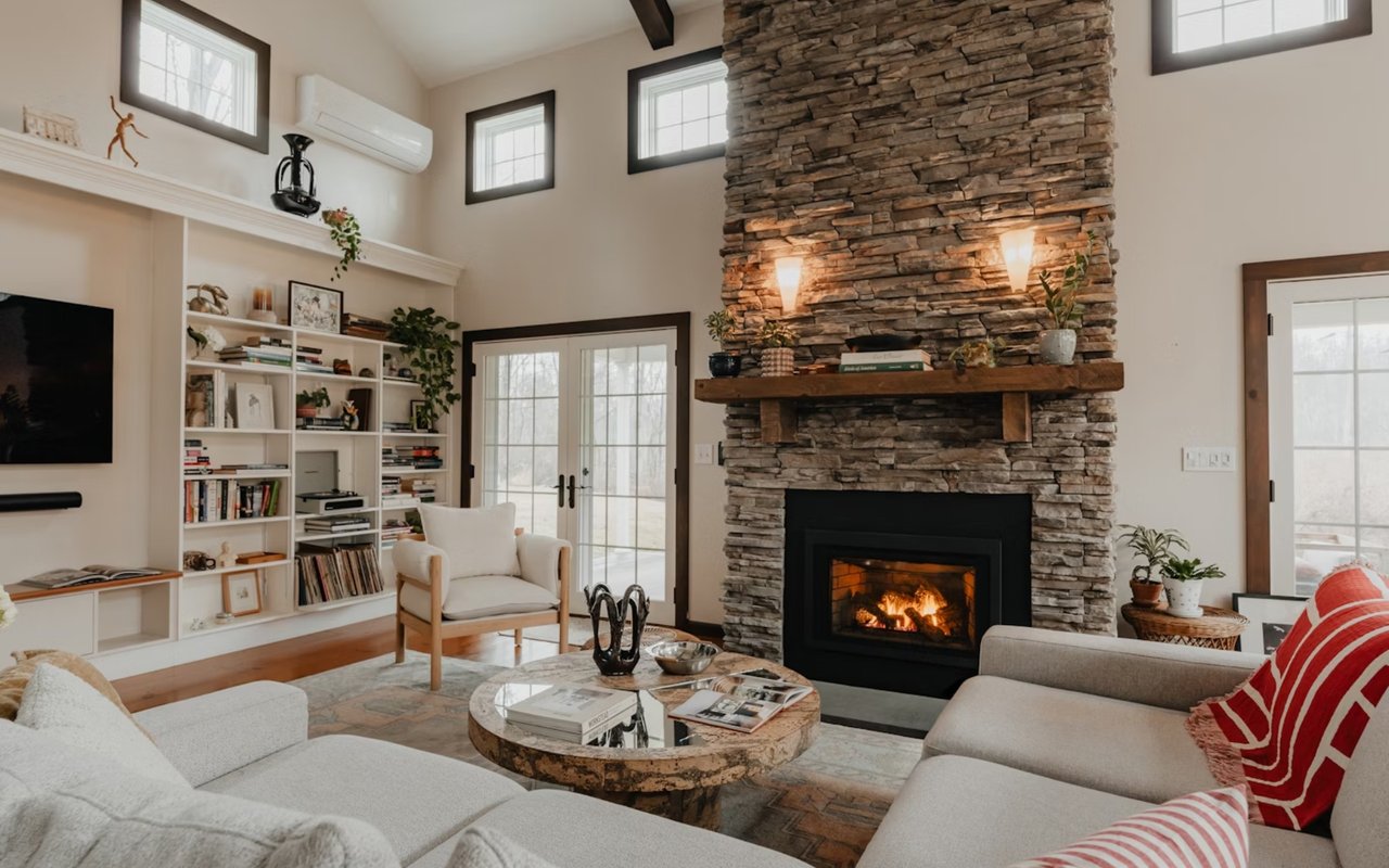
Color is one of the most powerful tools you have when shaping the atmosphere of your home. The right paint tone can make a small room feel expansive, bring warmth to a space that feels cold, or create a serene retreat where you can truly relax. Choosing colors is about much more than picking a shade you like on a swatch; it’s about evaluating how light, undertones, and finishes interact to create the overall feel of a room. When you understand the science behind color, you can create a home that feels harmonious, inviting, and perfectly suited to your style.
Start With The Building Blocks
Every paint color is a combination of hue (the basic color family), value (how light or dark it is), and chroma (how intense or muted it appears). If you only look at the small chip in the store, you miss how those three variables shift on your walls at full scale. You want to decide first whether your home calls for soft, desaturated hues or more saturated, high-energy tones. Then, dial in the right value so that the rooms do not feel heavy or washed out.
Light Reflectance Value, or LRV, is the number on the back of the paint swatch that tells you how much light a color bounces back into the room. Higher numbers mean more light reflection. Lower numbers absorb light. Use LRV to purposely brighten up a space with limited daylight or to anchor a sun-drenched room so it does not feel stark. Two colors with the same hue can feel totally different if their LRVs are far apart.
Light Reflectance Value, or LRV, is the number on the back of the paint swatch that tells you how much light a color bounces back into the room. Higher numbers mean more light reflection. Lower numbers absorb light. Use LRV to purposely brighten up a space with limited daylight or to anchor a sun-drenched room so it does not feel stark. Two colors with the same hue can feel totally different if their LRVs are far apart.
Respect The Power Of Light: Orientation, Bulbs, And Time Of Day
North-facing rooms often read cooler and grayer, while south-facing rooms glow warm and can push already warm colors into a yellow or beige direction. Meanwhile, east light is soft and golden in the morning, then fades. West light is weak early on but then fiery late in the day. You should test how your color reads during your busiest hours in that room, not just at noon.
Artificial light matters as much as daylight. The color temperature of your bulbs (measured in Kelvin) and their Color Rendering Index (CRI) change how accurately you see paints. If you plan to update your lighting, choose your bulbs first, then pick your paint.
Artificial light matters as much as daylight. The color temperature of your bulbs (measured in Kelvin) and their Color Rendering Index (CRI) change how accurately you see paints. If you plan to update your lighting, choose your bulbs first, then pick your paint.
Undertones And Metamerism: The Hidden Traps
Most “neutrals” are not truly neutral. They carry hidden green, blue, pink, or yellow undertones that only show up when you place them near other finishes. So, hold your candidate colors against your countertops, flooring, tile, and upholstery to see which undertones jump out. For instance, if your quartz has cool gray veining, a beige with a pink undertone will clash immediately.
Metamerism is the phenomenon where a color shifts when the light source changes. A gray that reads balanced in daylight can lean purple under LEDs. This is why you should never commit after seeing a color only in one store under one set of lights. Paint large samples, move them around, and watch them morning, afternoon, and night.
Metamerism is the phenomenon where a color shifts when the light source changes. A gray that reads balanced in daylight can lean purple under LEDs. This is why you should never commit after seeing a color only in one store under one set of lights. Paint large samples, move them around, and watch them morning, afternoon, and night.
Color Psychology You Can Actually Use
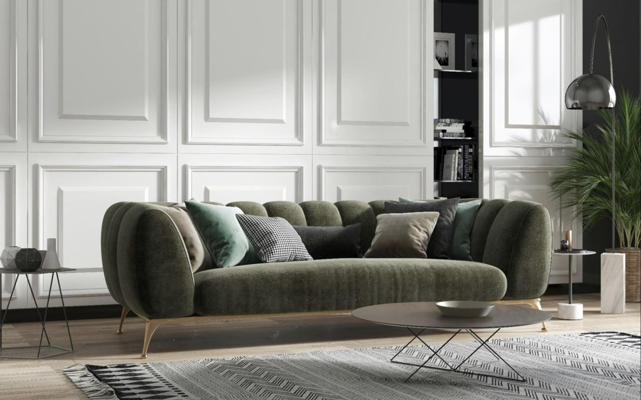
You want rooms to match their purpose. Soft blues and greens tend to promote focus and calm, whereas warm, muted reds and terracotta shades add intrigue and depth. Clean, bright whites can energize a space, while creamier whites soften edges and reduce glare. You should not follow generic charts blindly. Think about how you want to feel in each room and match that with the correct hue, value, and chroma.
Remember that saturation changes the mood as much as hue does. A highly saturated green can feel punchy and bold. A desaturated green with a gray base can feel elegant and grounded. If you love a color but it feels too loud, look for its more muted sibling in the same family.
Remember that saturation changes the mood as much as hue does. A highly saturated green can feel punchy and bold. A desaturated green with a gray base can feel elegant and grounded. If you love a color but it feels too loud, look for its more muted sibling in the same family.
Build A Whole-Home Palette With Intent
A cohesive palette flows from space to space without feeling repetitive. Choose one anchor neutral that works with your fixed finishes, and pick two or three accent hues that repeat with variation across rooms. You can shift value and chroma to create interest while keeping the same core DNA. This gives you consistency without monotony.
Many designers use the 60–30–10 guideline to balance dominance, support, and accent. Sixty percent is your main neutral or wall color. Thirty percent is secondary colors found on cabinetry, large furniture, or adjacent rooms. Ten percent is the accent that adds personality through powder rooms, doors, or statement walls. You can bend the ratio, but having a structure keeps decisions focused.
Many designers use the 60–30–10 guideline to balance dominance, support, and accent. Sixty percent is your main neutral or wall color. Thirty percent is secondary colors found on cabinetry, large furniture, or adjacent rooms. Ten percent is the accent that adds personality through powder rooms, doors, or statement walls. You can bend the ratio, but having a structure keeps decisions focused.
Choose The Right Sheen For Performance And Look
Sheen influences both aesthetics and maintenance. Flat and matte finishes camouflage surface imperfections and reduce glare, which can make contemporary spaces feel softer. Eggshell and satin add a gentle washability that works well in living rooms, halls, and bedrooms. Semi-gloss on trim and doors creates a crisp edge and stands up to constant cleaning.
Remember that sheen can also change how saturated or dark a color reads. Higher sheen reflects more light and can make colors look a touch brighter. Lower sheen absorbs light and can deepen the color slightly. If the exact appearance matters, sample the sheen you plan to use, not just the color.
Remember that sheen can also change how saturated or dark a color reads. Higher sheen reflects more light and can make colors look a touch brighter. Lower sheen absorbs light and can deepen the color slightly. If the exact appearance matters, sample the sheen you plan to use, not just the color.
Trend-Proof Your Choices (Without Feeling Boring)
Trends come and go, but thoughtful neutrals and nature-inspired midtones tend to age gracefully. You can still enjoy a timely pop by using bolder colors in smaller rooms, on interior doors, or on built-ins that are easier to repaint. Keep your ceilings and main circulation spaces consistent so the home flows, then let personality show up in contained moments.
Ask yourself whether you will love this color three years from now. If the answer is not a confident yes, choose a more timeless base and bring the trendiness in through art, textiles, or decor. Paint should enhance your architecture and lifestyle, not force you into a repaint next season.
Ask yourself whether you will love this color three years from now. If the answer is not a confident yes, choose a more timeless base and bring the trendiness in through art, textiles, or decor. Paint should enhance your architecture and lifestyle, not force you into a repaint next season.
Let Science Guide, Then Let Your Taste Decide
Color science gives you the tools to predict how paint will behave in your home. When you test thoughtfully, coordinate with finishes, and consider how you want each space to feel, you end up with a palette that looks beautiful, functions well, and lasts longer than any passing trend.
If you’re ready to find the right match, reach out to Dennis Kusenberger for trusted insight as you explore your real estate options in Fredericksburg, TX.
If you’re ready to find the right match, reach out to Dennis Kusenberger for trusted insight as you explore your real estate options in Fredericksburg, TX.